Basômetro
Outro dia encontrei uma visualização de dados no site Estadão. Era uma informação sobre a base aliada dos governos. Será que é dificil reporduzí-lo? O desafio estava feito. Provavelmente esse gráfico foi desenvolvido com o Javascript, mas quero refazê-lo com o ggplot.
Importação da base de dados
#devtools::install_github("RobertMyles/congressbr",force = TRUE)
#library(congressbr)
#vignette("congressbr")

library(readr)
basometro <- read_csv("C:/Users/Hp/Documents/GitHub/Base_de_dados/basometro.csv")
Filtro para o governo Bolsonaro
table(basometro$governo)
Bolsonaro 1     Dilma 1     Dilma 2      Lula 1      Lula 2     Temer 1
      81769      138002      132619      145827      204745      169418
library(dplyr)
# Filtro para o governo Bolsonaro
basometro_bolso<-basometro %>%
filter(governo=="Bolsonaro 1")Filtro para a orientação do governo
Sem a orientação do governo (!= Liberado)
table(basometro_bolso$orientacaoGoverno)
 Liberado       Não Obstrução       Sim
    18158     31796       368     31447
basometro_bolso_limpo<-basometro_bolso %>%
filter(orientacaoGoverno!="Liberado")
table(basometro_bolso_limpo$voto)
Abstenção       Não Obstrução       Sim
      209     29964      5230     28208
table(basometro_bolso_limpo$orientacaoGoverno)
      Não Obstrução       Sim
    31796       368     31447
table(basometro_bolso_limpo$voto,basometro_bolso_limpo$orientacaoGoverno)
              Não Obstrução   Sim
  Abstenção    91        14   104
  Não       24368        15  5581
  Obstrução  3268       252  1710
  Sim        4069        87 24052
Criação do indicador de apoio ao governo Bolsonaro
basometro_bolso_limpo$base_apoio<-ifelse(basometro_bolso_limpo$orientacaoGoverno=="Não" & basometro_bolso_limpo$voto=="Não","Apoio",
 ifelse(basometro_bolso_limpo$orientacaoGoverno=="Obstrução" & basometro_bolso_limpo$voto=="Obstrução","Apoio",
 ifelse(basometro_bolso_limpo$orientacaoGoverno=="Sim" & basometro_bolso_limpo$voto=="Sim","Apoio","Contra")))

tabela<-table(basometro_bolso_limpo$base_apoio) %>%
  prop.table()*100
Criação da tabela para a geração do gráfico
tabela<-data.frame(tabela)
tabela<-tabela[tabela$Var2=="Apoio",]
tabela<-tabela[tabela$Var1!="Sem Partido",]
Gráfico: primeira versão
library(ggplot2)
tabela<-tabela %>% arrange(desc(Freq))
partidos<-tabela$Var1
ggplot(tabela,aes(x = Freq, y = Var1)) +
geom_bar(stat = "identity") 
Gráfico: segunda versão
library(forcats)
tabela %>%
  mutate(Var1 = fct_reorder(Var1, Freq, .desc = FALSE)) %>%
  ggplot(aes(x = Freq, y = Var1)) +
  geom_bar(stat = "identity")
Gráfico: terceira versão
tabela %>%
  mutate(Var1 = fct_reorder(Var1, Freq, .desc = FALSE)) %>%
  ggplot(aes(x = Freq, y = Var1)) +
  geom_bar(stat = "identity",fill='red') +  theme_classic()
Gráfico: quarta versão
COR<-c(rep("red",10),rep("royalblue",10),rep("yellow",11))
tabela %>%
  mutate(Var1 = fct_reorder(Var1, Freq, .desc = FALSE)) %>%
  ggplot(aes(x = Freq, y = Var1)) +
  geom_bar(stat = "identity",fill=COR) +  theme_classic()
Gráfico: quinta versão
COR<-c(rep("#4c5270",10),rep("royalblue",10),rep("#36eee0",11))
tabela %>%
  mutate(Var1 = fct_reorder(Var1, Freq, .desc = FALSE)) %>%
  ggplot(aes(x = Freq, y = Var1)) +
  geom_bar(stat = "identity",fill=COR) +  theme_classic() %>%
  labs(x= "Percentual de votos a favor do governo", y="Partido",
       title="Percentual de votos a favor do governo Bolsonaro até setembro/2019")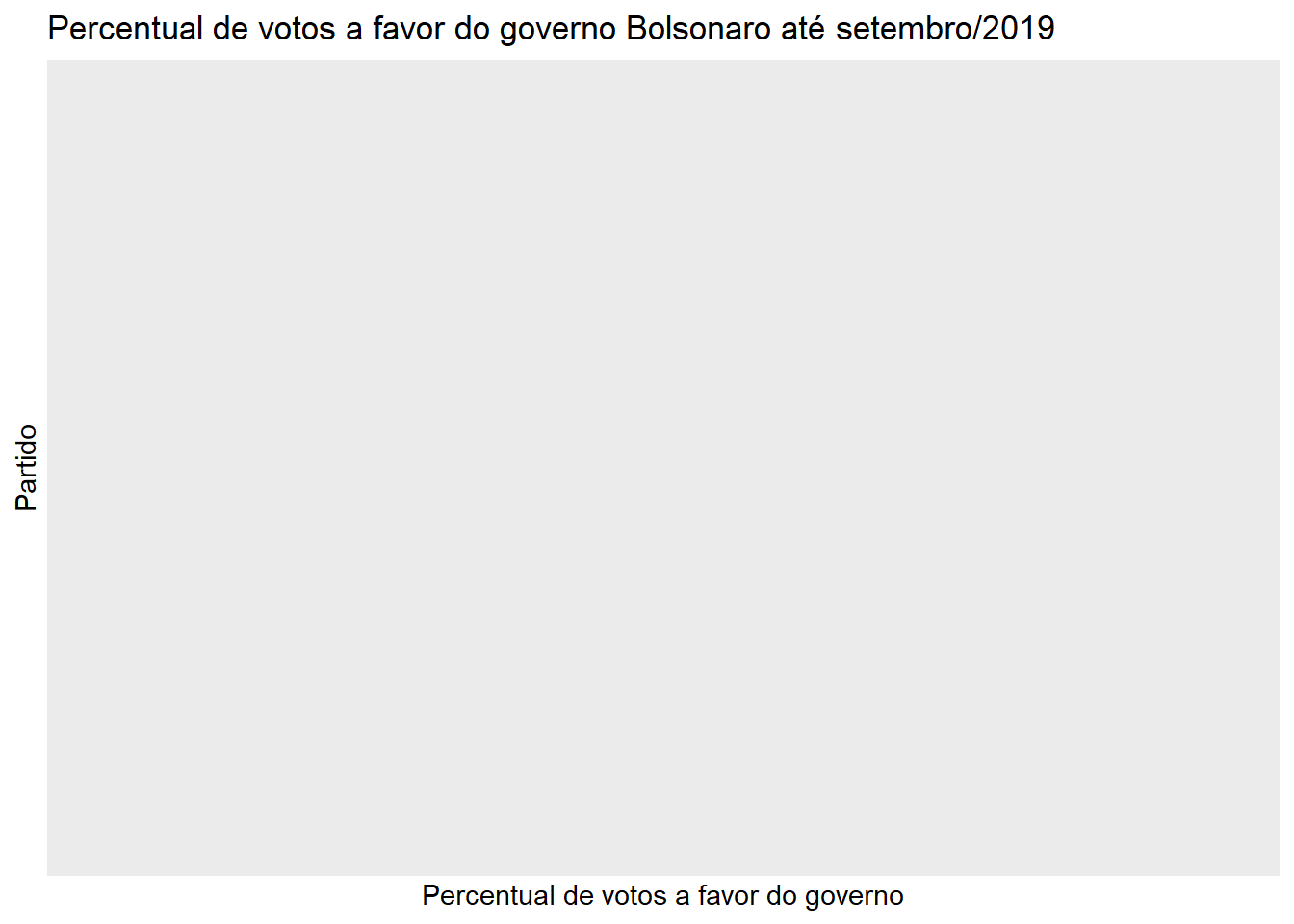
Gráfico: sexta versão
grafico<-tabela %>%
  mutate(Var1 = fct_reorder(Var1, Freq, .desc = FALSE)) %>%
  ggplot(aes(x = Freq, y = Var1)) +
  geom_bar(stat = "identity",fill=COR) +  theme_classic() +
  # PSL
  annotate(geom = "curve", x = 108.5, y = 29, xend = 98.5, yend = 31, curvature = .3, arrow = arrow(length = unit(2, "mm")) ) +
  annotate(geom = "text",  x = 109, y = 29, label = "PSL 98%", hjust = "left")+
  # NOVO
  annotate(geom = "curve", x = 100.5, y = 26, xend = 95.5, yend = 28, curvature = .3, arrow = arrow(length = unit(2, "mm")) ) +
  annotate(geom = "text",  x = 101, y = 26, label = "NOVO 95%", hjust = "left")+
  # PSDB
  annotate(geom = "curve", x = 98.5, y = 24, xend = 95.5, yend = 26, curvature = .3, arrow = arrow(length = unit(2, "mm")) ) +
  annotate(geom = "text",  x = 97, y = 23.5, label = "PSDB 94%", hjust = "left")+
  # PDT
  annotate(geom = "curve", x = 48, y = 6, xend = 44, yend = 6, curvature = .3, arrow = arrow(length = unit(2, "mm")) ) +
  annotate(geom = "text",  x = 49, y = 6, label = "PDT 43%", hjust = "left")+
  # PT
  annotate(geom = "curve", x = 30, y = 2, xend = 15.5, yend = 2, curvature = .1, arrow = arrow(length = unit(2, "mm")) ) +
  annotate(geom = "text",  x = 30, y = 2, label = "PT 15%", hjust = "left")+
  # PSOL
  annotate(geom = "curve", x = 20, y = 1.5, xend = 12.5, yend = 1, curvature = .1, arrow = arrow(length = unit(2, "mm")) ) +
  annotate(geom = "text",  x = 20, y = 1.5, label = "PSOL 13%", hjust = "left")+
  # HACK para melhorar o grafico
  annotate(geom = "text",  x = 111, y = 1, label = ".", hjust = "left")+
  labs(x= "Percentual de votos a favor do governo", y="Partido",
       title="Percentual de votos a favor do governo Bolsonaro até setembro/2019")

grafico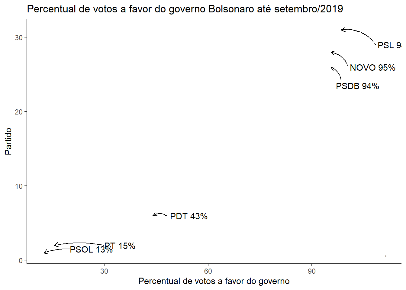
#ggsave("basometro.png")Versão final

Claro que pode ser melhorado, mas fico por aqui.